Lavazza


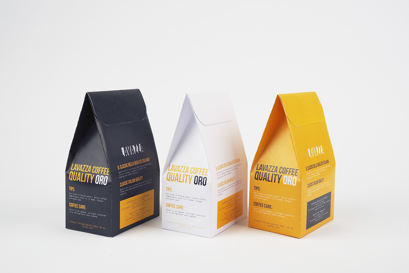
This packaging project for Lavazza featured three unique flavors, each represented by a specific main color. The choice of colors directly reflected the flavors showcased in the project.
During the brainstorming phase of the project, I opted for a minimalist, rustic, yet vibrant aesthetic for the packaging. This decision was aimed at distinguishing the product from competitors. It involved using bold and distinctive colors to add character to the packaging and draw attention.
I was thrilled with the outcome of this project because it marked one of my initial experiences in packaging design. It confirmed my talent and deep passion for creating packaging at that time.


